MONTEYS

BRIEF
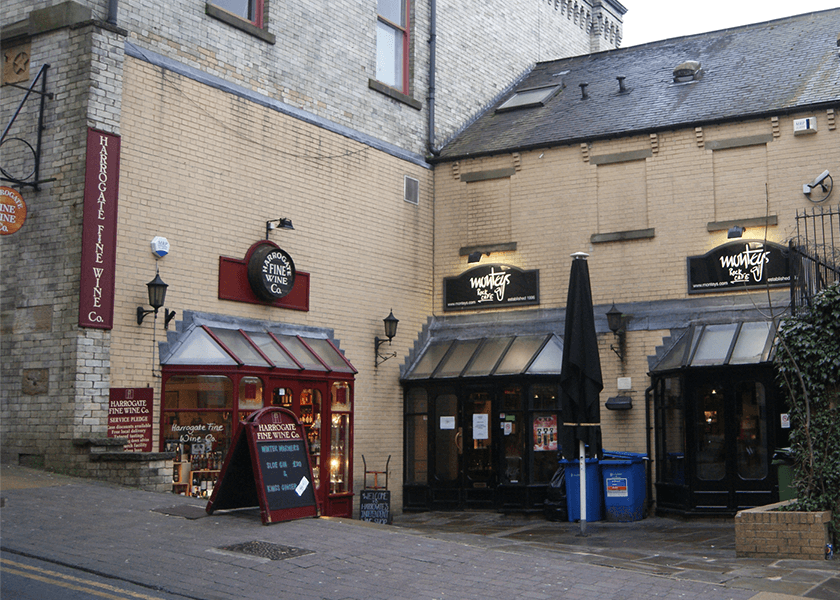
Montey’s is a successful rock bar that has been in Harrogate for many years but was starting to look dated and had new competitors popping up that looked modern with aesthetically pleasing signage. Montey’s had a new logo designed but the challenge was to get the signage to look timeless and to keep attracting customers new and old.
SOLUTION
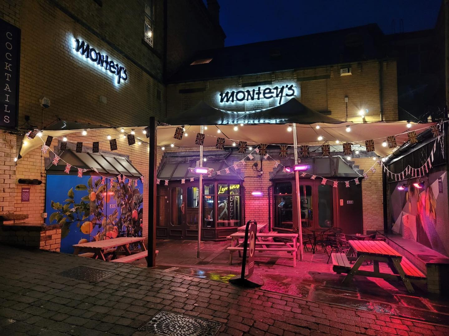
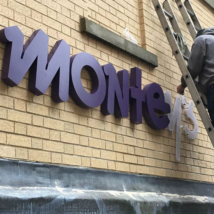
The old logo and colour scheme needed a refresh so new logo was simplified and brought back to date. The colour scheme was also changed, moving away from black and white to a dark purple shade that lifted the brand and made it look stylish and sophisticated. We decided to use chunky halo lit 3D letters to give impact in the day and to stand out at night. Other signage and window graphics were also changed to match and compliment the new colour scheme.

“The SignHub team have proved invaluable to us at Montey's for some time now.”
OUTCOME
We worked closely with Montey’s to make sure they were happy that the proposed signage and fitted with the new brand identity. The end results looked great and the new signage really stands out, especially at night with the halo lit letters. The team at Montey’s were very pleased with the new signage and said they had very positive feedback from customers straight away.